Responsive vs Adaptive Design - What's the difference?

Smartphones, tablets, smart TVs, watches, and other devices are becoming increasingly popular as the means of internet browsing. Designers must adapt to all these screen resolutions to provide the best user experience for each device. That is where responsive and adaptive design comes in.
Responsive and adaptive design are two terms that are often used interchangeably. But they are not the same. This article will look at the differences between the two and how they are used in web design.
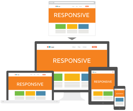
Responsive Design
Responsive Web Design (RWD) is a web design approach that allows a website to adapt to the screen size of the device it is being viewed on. It is a technique that uses CSS media queries to change the website's layout depending on the screen size. The website's design is altered by changing the width of the elements, hiding elements, or changing the position of elements.
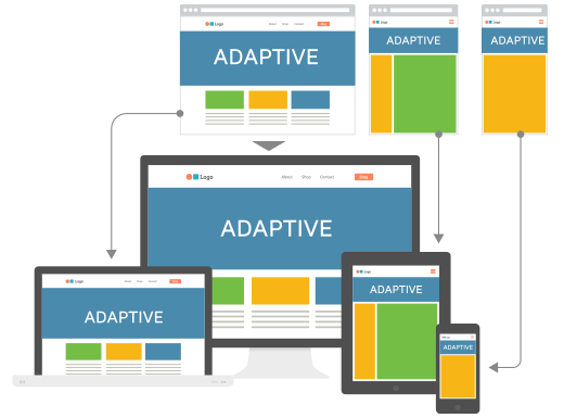
Adaptive Design
Adaptive Web Design (AWD) is a technique that use pre-defined screen sizes (320px, 480px, 768px, 1024px, 1280px, 1440px, 1920px, etc.) and create a custom layout for each screen size. When a certain device is detected, the website will load the layout that is designed for that screen size. This technique is more flexible than responsive design because it is limited to pre-defined screen sizes.
Responsive vs. Adaptive Design
Responsive and adaptive design allows a website to adapt to different screen sizes. But they are not the same. Here are the differences between the two:
- Responsive design uses CSS media queries to detect the device's screen size. Adaptive design uses pre-defined screen sizes to detect the device.
- Responsive design is more flexible than adaptive design because it can adapt to any screen size. Adaptive design is limited to pre-defined screen sizes.
- With Adaptive design, the information is pre-selected, and only the specific files are loaded. The information is loaded and then hidden or shown with a Responsive design depending on the screen size.
- With Adaptive design, a desktop version of the website is not dependent on the mobile version. You can test different mobile features without hiding them on the desktop. You can assign different teams to work on different screens. However, with responsive design, only one code base is used for every screen size.
- Adaptive design is better for user experience. You want to avoid showing the bigger-sized version of your desktop design for your mobile users. Mobile users want to see an interface that is designed for touch.
- Adaptive design can be up to 60% smaller to download than responsive design.
Examples of Responsive and Adaptive Design
Many popular websites use one of these techniques to provide the best user experience for their users. Here are some examples of responsive and adaptive design:
Responsive Design
Adaptive Design
Conclusion
In conclusion, neither is better or worse than the other. It depends entirely on the project and the requirements. For example, if you are building something complex, want maximum control over the design, and are willing to invest more time and resources, then Adaptive Design is the way to go. On the other hand, if you are building something simple and want a single code base for all screen sizes, you should opt for responsive design.
Responsive design, at this point, is the most popular technique used by web designers. It is also the most flexible and easy to implement. It is also the most cost-effective technique. It provides consistency so that a user can continue browsing from a phone and still have a familiar experience. However, mobile users want to swipe, tap, pinch, etc. That is why Adaptive design is better for user experience, that's how you get the native app feeling to your web apps.